Origin of the company name and logo
Origin of the name “Chugai”
When Chugai was established as “Chugai Shinyaku Shokai” (March 10, 1925), the founder Juzo Ueno named the company “Chugai” to mean “domestic and overseas,” indicating his aspiration to eventually market Japanese drugs overseas.
Origin of the Logo

1931 (Showa 6)
The first logo is a graphical representation of CSS, an acronym for the company’s English name, Chugai Shinyaku Shokai.


1937 (Showa 12)
When the Takada Plant was built, we adopted the initials “T (Tyugai) SS,” which also stood for Chugai Pharmaceutical Trading Company, as our company logo.

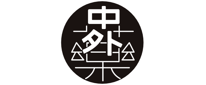
1938 (Showa 13)
Around 1938, the company changed its logo to one based on the company name “Chugai” with the Chinese character for “medicine” in the background.


1947 (Showa 22)
The logo was designed around an ampoule of an injectable drug called “Zalso brocanone (Zalbro)” (developed in-house in 1930), an analgesic, anti-inflammatory, and antifebrile agent, which was one of the main products at the time, and a benzene nucleus in the middle, symbolizing the Chinese character for “inside” which is part of Chugai’s name.

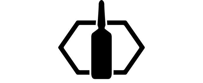
1962 (Showa 37)
The round-shaped injectable drug ampoule was changed to the current sharp ampoule shape.


1968 (Showa 43)
The logo is used together with the name “Chugai” at the bottom.


1979 (Showa 54)
In August of 1979, we changed the design of the corporate logo to strengthens its appeal and established its meaning as a corporate symbol by placing the word CHUGAI within the logo. At the same time, the corporate color is “Chugai Green,” which colorfully expresses “life,” “safety,” “growth,” and “cleanliness,” all of which are appropriate for a health-related company.

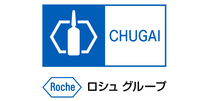
2002 (Heisei 14)
In October, on the occasion of the strategic alliance with F. Hoffmann-La Roche, we introduced the Roche logo underneath the existing design to indicate that Chugai is a member of the Roche Group. In addition, the corporate color was changed from green to blue to reflect the colors of the sea (We will develop new drugs by looking deeply into the mother sea and life to its roots), the color of the sky (We will pursue the limitless possibilities of drug discovery so that we can fly freely in the sky), the color of the earth (We will observe the “life” of all people living on this planet from a global perspective.)


